About the brand

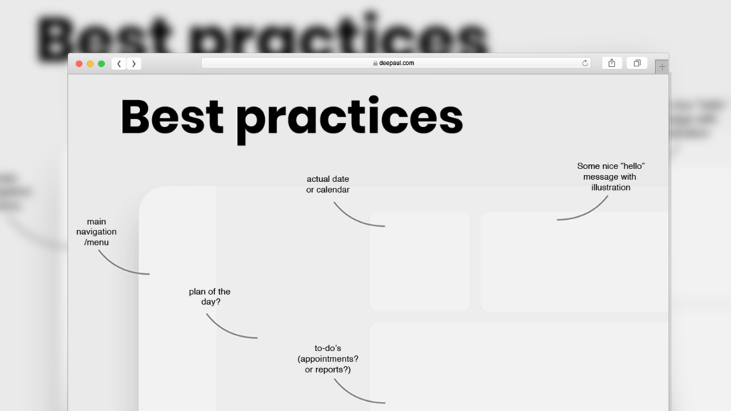
The build process
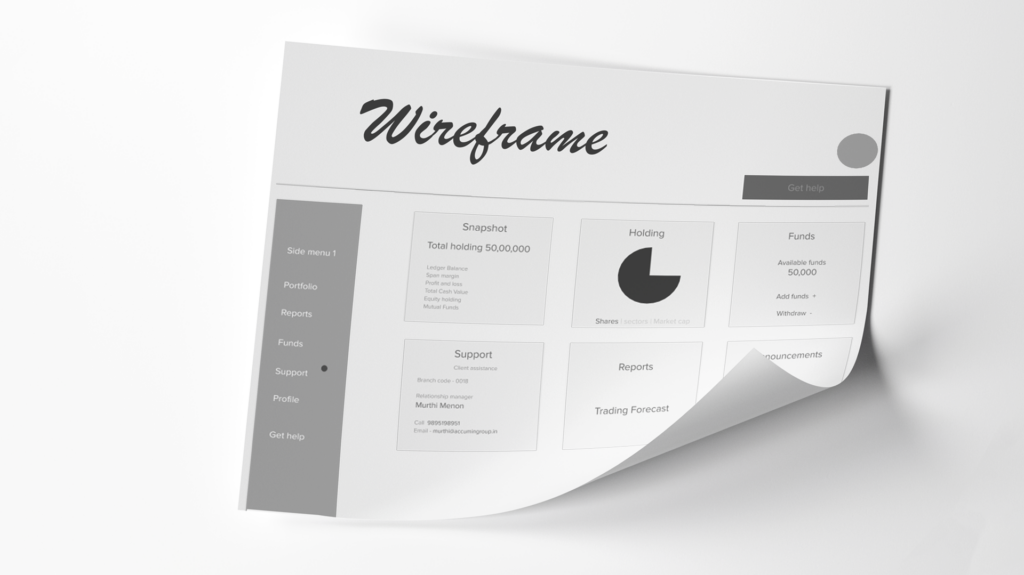
The idea of making the dashboard carry all high-value information on one screen was the challenge. Wireframing was used to solve this problem.
Thoughtful design
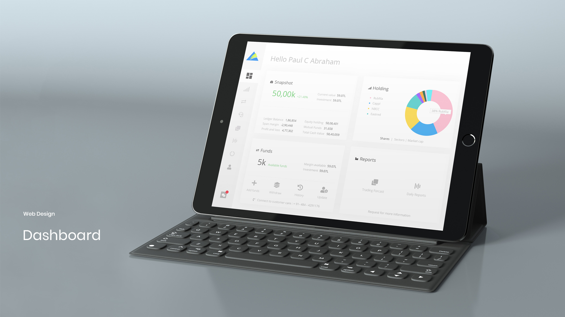
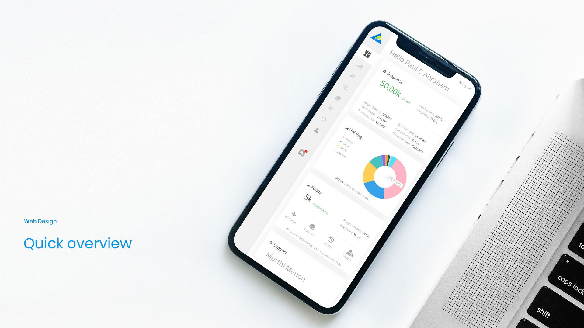
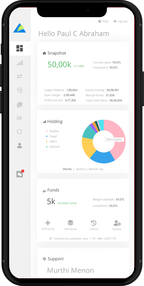
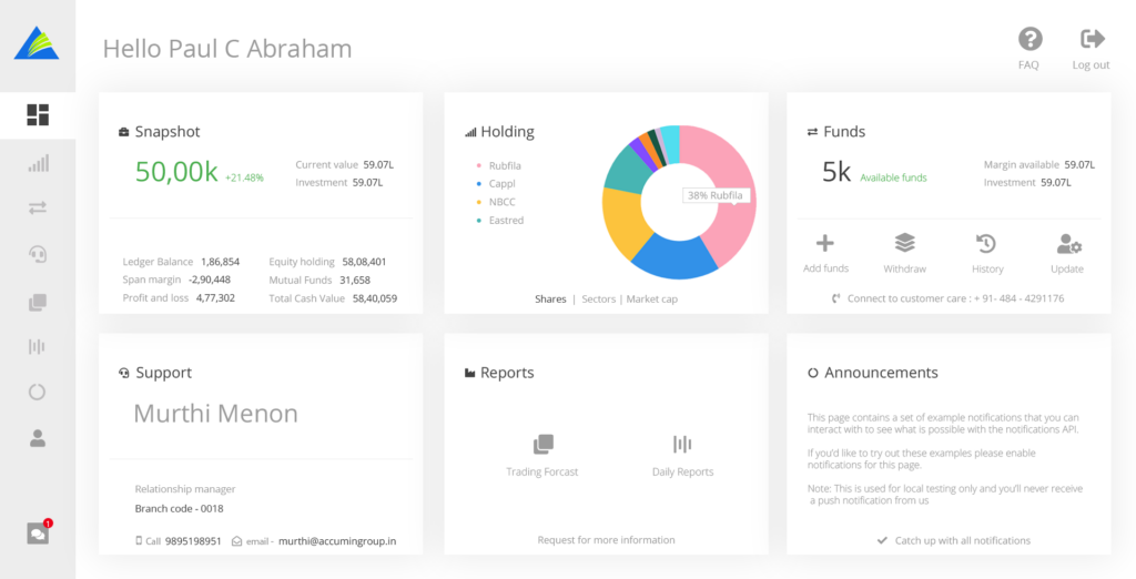
A card-based minimalist design can help users to have an overview of their account. Personalization was added by showing a welcome message by name. A quick and easy access collapsable side menu made the space look clean. The tiled layout can accommodate much more information than it displayed earlier.
Users can now take informed decisions understanding real-time market trends.
Now the dashboard can present market trends, performances, and portfolios in a split second. Users can now have a clear understanding about the market volatility, how much resources they have at the given point of time, and how much stocks they own without switching between multiple screens.
Old v/s New
After numerous discussions with the in-house team, the exact requirement was gathered in order to make the build process go smooth and steady. The newly suggested design has modern sidebar navigation along with a card-based layout. Designed with customization in mind, personalization and safety was the focus. A warm greeting message while logging in, quick response support team – all made users’ life easy! With all these collective efforts, Acumen’s sales team witnessed increased trading activities as the dashboard helped their clients to do more trading much easier than ever before.
Dashboard Features
Users always found the data on the dashboard relevant and instantaneous
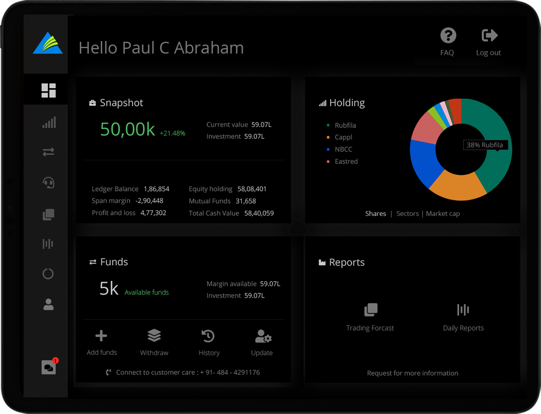
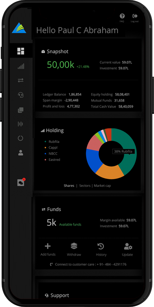
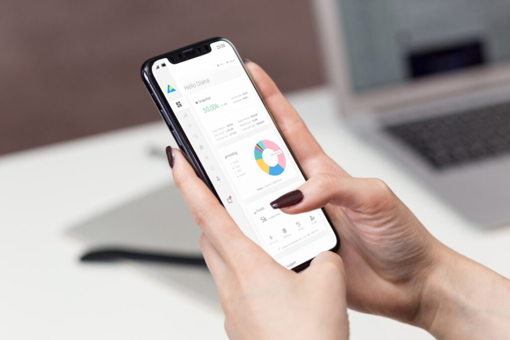
Snapshot
This showed the total market value in their portfolio, along with invested amount and profit gain/ loss percentage
Holdings
A infographic approach of their holdings which can be arranged by shares, sectors or market cap.
Funds
Pre-Shows available funds, options to add, modify info, or withdraw funds.
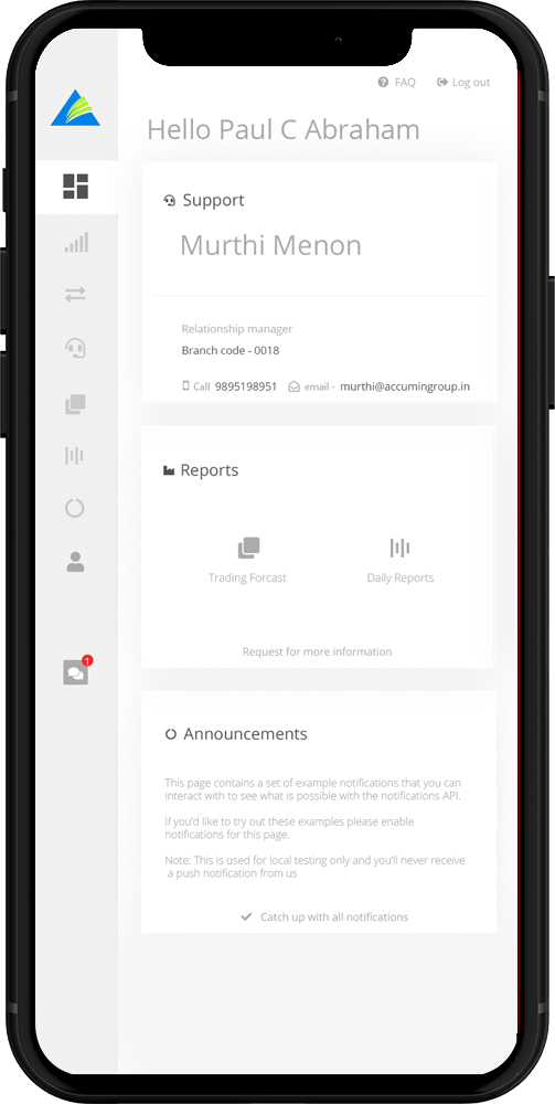
Support
Personilized support function with a portfolio manager to make user connect on a human level.
Reports
All the official reports, financial documents, and data on a daily level basis.
Announcements
All the latest happening witin the industry which get automatically.
Sleek sidebar
Sidebar with icons make the dashboard inteface clean and easy to use.
Exit buttons
Exit buttons and FAQ kept at prominent locations just to make sure the user feels safe around the system.
Message box
The use of a message box made it easy to push notification style of promotions and quick communication with clients.