About the Realtor – Nidhi Sharma
Every property decision needs clarity and someone clients can trust. Nidhi Sharma helps buyers, sellers, and investors in Pennsylvania make informed moves across residential and commercial real estate. Her brand needed to feel warm and personal, with the confidence and polish clients expect from a knowledgeable advisor.
A mark built around guidance
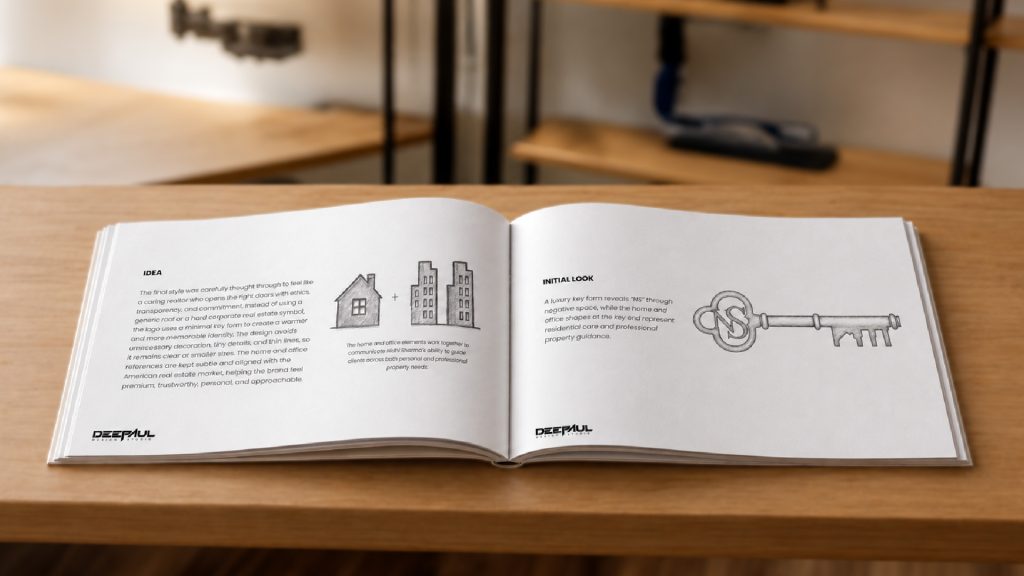
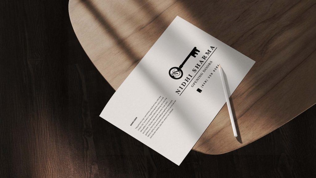
The final identity begins with a refined key, a symbol of access, trust, and guidance. The NS monogram sits in the bow in negative space, while the key teeth incorporate a home and office silhouette. Together, they represent Nidhi’s expertise in residential and commercial real estate without relying on familiar real estate clichés.

Solutions
Logo Design
Brand Identity System
Brand Guidelines
The Result
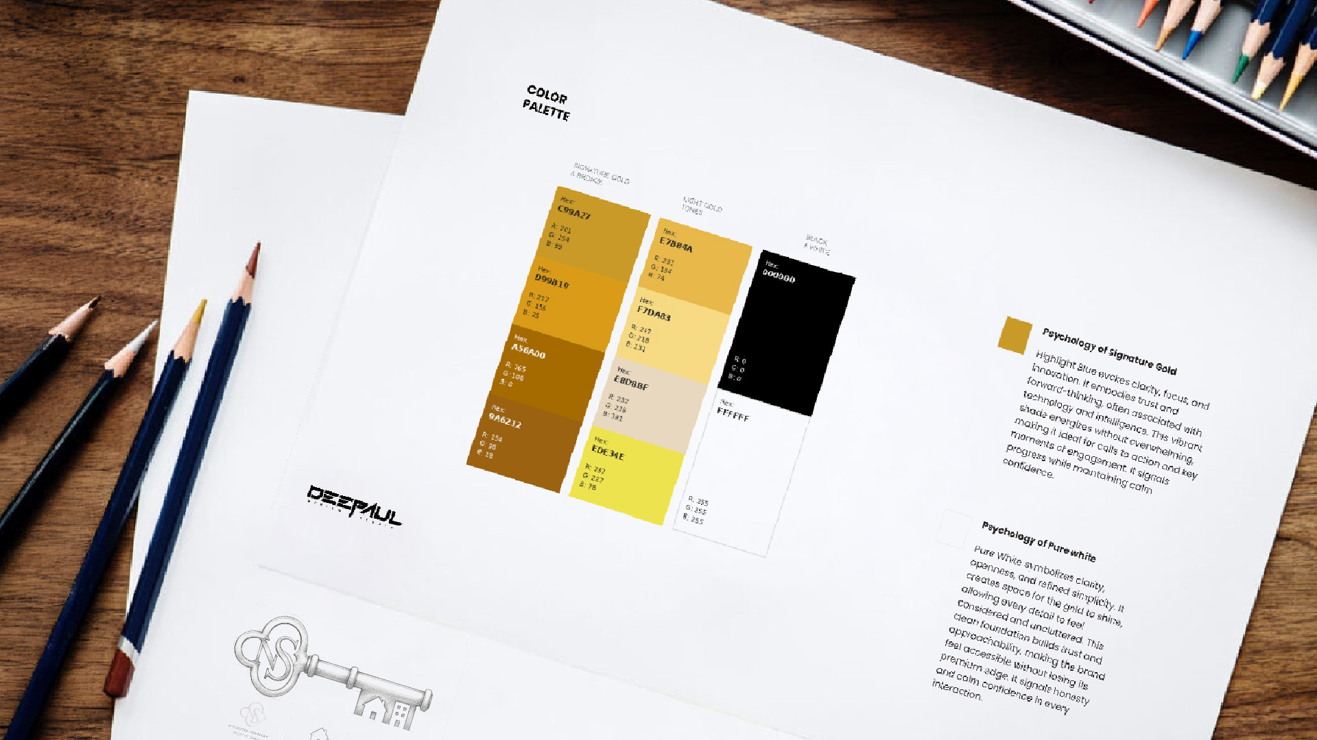
The identity initially explored gold to create a luxurious and premium impression. However, as the brand developed, gold began to feel more decorative than personal—and less distinctive within the real-estate industry, where it is widely used.
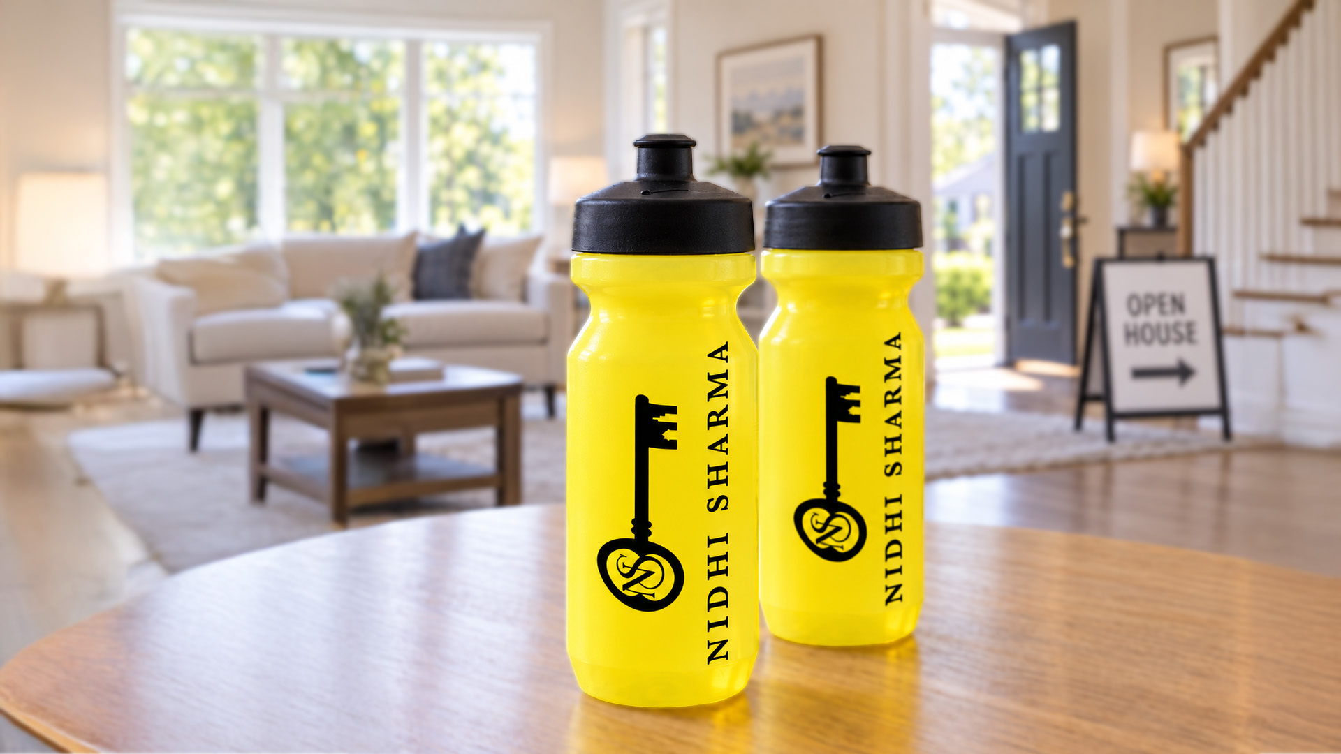
The direction evolved toward black and yellow because it felt more confident, visible, and human. Black communicates trust and professionalism, while yellow introduces warmth, optimism, and the feeling of new possibilities. It also creates a natural connection with Weichert’s established visual world without making Nidhi’s identity feel secondary.
Combined with the negative-space “NS” and subtle property details, the final direction feels less like a conventional luxury emblem and more like an approachable, memorable symbol of someone who helps people open the right doors.